Best Email Marketing Newsletter Design To Optimize Click Through Rate
A few weeks ago I did a test with my Profitworks newsletter to test a theory I had. The theory was really more of an idea than a theory, as I thought changing the design of my newsletter might increase the open rate and click through rate. Part of me also thought it might also reduce the click through rate. I knew one would probably do drastically better but I did not a strong hunch as to which one. My thought was if I could learn how to drastically increase click through and open rates, my email marketing efforts would be more successful at getting more customers for my business and my clients who I do email marketing for. My thought was if I could find a way to double the open and click through rate, I should be able to double the revenue generated from my email marketing efforts. Click here to check out our Free Email Marketing Guide which is full of great tips to help improve your newsletter's open and click rates.
The design I wanted to test was in the form of a short personalized note to my newsletter list, with only one or two links. My thought was this might increase the open rate because I think people are more prone to open a personal note then a fancy newsletter with lots of graphics. Then again I thought this might reduce click through rates as there would be less options for where people could click as there would be no clickable images and only two links versus over 40 in my existing newsletter. I was really excited to see which one would perform better and to see what I could learn.
Here is a quick video summary of the test and the results if you like watching videos instead of reading. For those that enjoy reading more than watching videos, continue reading below. If you are not familiar with what any of the terms in this video or article mean, check our marketing terms dictionary.
To Leave a comment for this video go to Youtube.com
You can find more videos related to getting more customers on Profitworks' Youtube Channel.
The Controls
- each newsletter was sent with the same subject line which was "Ideas to get more customers - Profitworks"
- each newsletter had the same from line which was "Chris R. Keller"
- each newsletter was sent at roughly the same time, option #1 was sent on Monday January 9th at 8:47 am and option #2 was sent on Monday January 9th at 8:46 am
- each newsletter was sent from the same email server
- both featured a link to a recent article on Google+ and how to use it to get more customers
The Two Different Email Newsletter Designs
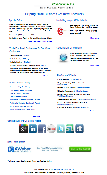
Option #1 - My Stand Email Newsletter (The Control)

Important notes about this design: It contains over 45 links and features both a sales and marketing insight of the month
Option #2 - A Short Personalized Note

Important notes about this design: It contains only 3 links and the unsubscribe link would probably show above the fold in most email previews.
The Results
Option #1 - My Stand Email Newsletter (The Control)
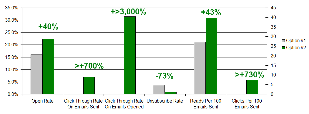
Open Rate = 16.0%
Reads Per 100 Emails Sent = 27.2
Click Through Rate On Emails Sent = 0.0% 7
Clicks Per 100 Emails Sent = 0.0
Click Through Rate On Emails Opened = 0.0%
Unsubscribe Rate = 3.7%
Option #2 - A Short Personalized Note
Open Rate = 22.4% (Better than Option #1)
Reads Per 100 Emails Sent = 39.6 (Better than Option #1)
Click Through Rate On Emails Sent = 7.0% (Better than Option #1)
Clicks Per 100 Emails Sent = 7.3 (Better than Option #1)
Click Through Rate On Emails Opened = 31.4% (Better than Option #1)
Unsubscribe Rate =1.0% (Better than Option #1)

The Winner = Option #2 - The Short Personalized Note
The short personalized note beat the original design on all metrics, and by a significant margin. Based on these results moving to this type of design for your newsletter should result in a 700%+ increase in clicks and revenue. If you are looking to optimize your email marketing newsletter you should definitely employ a template that is in the form of a short personalized note similar to the one shown in this test.
If you are a business that does not use email marketing I would highly recommend you take advantage of this tool. It can be a great marketing tool and is often referred to as the top return on investment marketing initiative for businesses. If you don't know where to start sign up for Aweber orConstant Contact. Both systems are low cost, easy to learn and very effective to use. I think Aweber also has an offer on right now where you can sign up for $1 for a one month trial. Forwebsites built on Joomlathe email marketing programAcymailing is also a great option.
Other Related Articles You Might Be Interested In
1. Email Marketing - See the complete list of articles related to email marketing
4. Email Marketing From Title Optimization
My name is Chris R. Keller. I work at Profitworks Small Business Services helping various B2B small businesses in Waterloo and Kitchener Ontario generate new customers. Feel free to connect with me on Google+ or if you are just interested in getting new customers for your B2B small businesses enter your email in the box provided below and click the "Send Me Free Updates" button.
I hope you have enjoyed this on how to improve your click through rates by changing the design of your email newsletters. If you liked this article please be sure to share it on Facebook, Linkedin, Twitter, Google+ or any social media network you are on.
