10 Ways To Make Your Lead Generation Website Convert On The First Visit
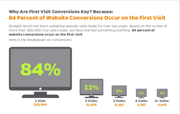
First impressions can be extremely important, and nowhere is that more apparent than in the world of Internet marketing. Lead generation websites need to be optimized so they drive visitors to convert right away. Because, in the clear majority of cases, the first impression is the only impression a website gets. Here at Straight North, we’ve analyzed more than 350,000 conversions and found that over 80 percent of the time, conversions happen on the first visit. With that in mind, here are some tips for building a lead generation website that drives more first-time visitors to convert.
Content That Stimulates Action
1. Don’t bury the lead. Use headlines and subheads to hammer home key benefits.
2. Less is more. Make one big idea sink in, rather than try to fill the visitor’s head with everything.
3. Create mystery. The website is there to make the visitor want to talk to the salesperson.
4. Avoid jargon. Technical terminology confuses visitors.
5. Make it scannable. Use headlines, subheads, bold text and bulleted lists liberally to help visitors visually lock in on the main ideas.
Intuitive Navigation
1. Use standard navigation labels. Weird navigation makes visitors think unnecessarily.
2. Limit main navigation elements. Main navigation should never have more than five or six options.
3. Use drop-down menus with care. Make sure your drop-down options are clearly labeled, fit the category and are not too numerous.
4. Redundancy is OK. Displaying both breadcrumbs and secondary navigation on the sidebar is perfectly acceptable.
5. Be consistent. Secondary navigation should be consistent in style and position across the site.
Relevant, Custom Imagery
1. Use captions.
2. Use a professional photographer.
3. Keep a consistent style. Maintaining the same color palette and visual style ensures your brand impression is strong and memorable.
4. Avoid rotating header carousels. Studies show that rotating carousels are conversion killers.
5. Display images consistently. The top of the page and the top right area of the page are always good spots for images.
Persuasive Credibility Elements
1. Use customer testimonials. Customer reviews carry more weight than what a company says about itself.
2. Show logos of well-known customers. If you do business with big-name organizations, let the world know.
3. Feature third-party mentions. A “News” section is a good place to provide third-party content.
4. Use facts, not fluff. Saying you have great service means far less than saying you’ve delivered 99.7 percent of your orders on time since 2003.
5. Focus on the right facts. What attributes of your company matter to customers?
Get Personal
1. Liven up those bios. Consider adding a few personal details like where the person went to school, hobbies and interests.
2. Talk about charitable efforts. Visitors may be quite interested to know what charitable causes your organization supports.
3. Add video. Video clips are highly effective for creating a conversational, personal vibe on your site.
4. Highlight company events. Photos from corporate events speak volumes about your corporate culture and values.
5. Use an informal writing style. Content written in the style of a personal, one-to-one letter or phone conversation has become the standard.
Irresistible Calls to Action
1. Smart placement. Place call-to-action blocks below highly persuasive portions of content.
2. Consistent placement. Have a simple but strong call to action in the header and footer.
3. Give your offer substance. $10 off an initial order of $5,000 isn’t enough of an incentive; $500 is.
4. Make your offer time-sensitive. Open-ended offers are invitations to delay.
5. Guarantee your offer. Reassure prospects with lifetime guarantees, no-charge/no-hassle returns, etc.
User-Friendly Forms
1. Limit form fields. The fewer required fields, the better.
2. Provide cues. Use drop-down menus so visitors can select the option(s) that make sense.
3. Display a privacy message.
4. Include the phone number. Visitors may change gears and decide to call instead of submit a form.
5. Make forms mobile phone-friendly. Mobile users need larger form fields and forms that fit properly on their mobile screens.
Prominently Displayed Phone Number
1. Consistent, prominent placement. The phone number should appear prominently at the top right of the page template in desktop view.
2. Make the phone icon a clickable link. When mobile users click on your phone icon, it should automatically display the phone number with a call option.
3. Label phone numbers clearly. If you display other numbers, such as a customer service phone number, label them accordingly.
4. Invest in a toll-free number.
5. Track phone inquiries. Many companies fail to set up phone call tracking, and thus have no idea which marketing sources generated the phone leads.
Continuous Testing
1. Deploy granular phone and form tracking. Tracking should tell you the marketing source of every phone and form inquiry.
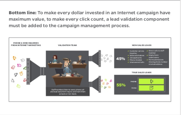
2. Validate inquiries. Beyond tracking, validation is needed to separate actual leads from non-leads (spam, personal calls, etc.) in analytics reports.
3. Test only one variable at a time. If you change the offer and the position of the offer on the page, how can you tell which change led to an increase or decrease in conversions?
4. Little details can make a big difference. Companies usually test big elements like offers, but the size of the font or the color of a submit button can have a huge impact on conversions.
5. Always test functionality. Savvy companies continually test clickable phone numbers, form submission processes and page-loading speed.
Mobile-Friendly Design
1. Responsive design. Responsive website design enables your website to adjust automatically for optimal display on any size screen.
2. Sticky navigation. This design technique keeps the main menu in view at the top of the screen as the mobile user scrolls down a page.
3. Embrace vertical scrolling. Visitors are now accustomed to scrolling and are OK with it.
4. Maximize page-loading speed.
5. Avoid PDFs. Convert sales brochures to HTML pages instead of/in addition to offering them as downloads.
If you find this information useful feel free to reference the presentations that this data is from
https://www.slideshare.net/
Author Bio:
Aaron Wittersheim is Chief Operating Officer at Straight North, an Internet marketing company. His focus is on Internet marketing and website services, and technology.