5 Best Practice Website Design Rules For More Web Leads and Sales
In this guest post by Dave Smith from DaveMSmith.com, Dave discuss four key things he has learned to drive sales from a website (both online and offline sales that can be attributed to a website visit). These four things are to use high quality content, having a clear proposition, clearly showing visitors what to do, offering a sample experience and showing a picture of a smiling face. Websites are often the first impression people get for your business and creating a great first impression is critical to turning interested prospects into paying customers. Therefore converting a website visitor into a paying one is directly tied to website design and these 5 best practices rules will help you do just that.
5 Website Design Rules For Greater Sales
Perfecting a web site is a never-ending process as there will always be ways to improve its appearance and performance. However, I have found a few rules that offer great return for the time invested.
1. Use High-Quality, Unique Images
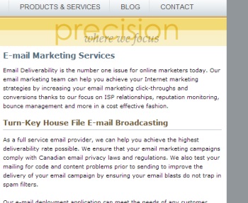
Nothing says "home-made web site" faster than stock photos and clip art. As with many new businesses, I was hesitant to spend money on professional photography for my first website and instead opted for royalty-free stock images found online. I quickly realized that visitors could not see the value in products or services that use stock images on their website as it makes a website look just like every other cheap site. I have found that investing less than $100 in a few professional photos will be able to create personality for your website and began to convert visitors into paying subscribers.
Bad
|
Good
|
2. Make the Proposition Clear
There is a tendency to cram as much information into the prime real estate of a site's home page. This is a mistake. I have found that a short explanation of the product or service, combined with a high-quality, unique image and a compelling call-to-action can make for a very clear proposition. Adding more to the design only risks losing a visitor before he or she fully grasps the value being offered.
Bad
|
Good
|
3. Show Visitors What to Do
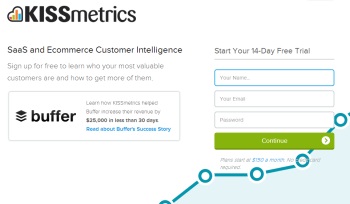
Speaking of being clear, it is important that a web design clearly guides visitors to the right information, pages, or actions. When someone visits Kissmetrics it very clear what they want you to do. They want you to sign up for a 14 day free trial. This goal is clearly indicated on the page as it takes up about 50% of the page. Are the goals of your website clearly laid out in the web design? If not a lot of traffic will not be captured as paying customers or as contacts that could later be converted into customers. When designing a new site it is important to continually ask, "What is this page asking a visitor to do?"
Bad
|
Good
|
4. Offer a Sample Experience
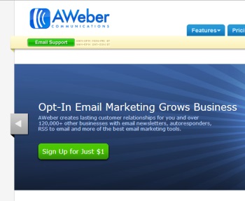
It is often intimidating to purchase something without first knowing what it is like and what it can do. A great way to combat this is to allow people to try your service free before buying it. An effective strategy can often be to make this one of the most frequent call-to-actions found on their site. By constantly asking people to try the service (for free of course) to prove that it is worth paying for you should see a significant increase in sales. The same should be done for any product based website. Services can be demonstrated through free trials whereas products can be experienced using interactive images, testimonials, or through video.
Bad
|
Good
|
4. Show a picture of a smiling face
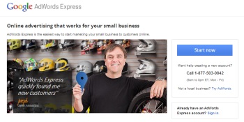
Our testing has indicated that showing a smiling face on your home page will lead to increased engagement, an improved perception of your business an increase in conversion rate and an increase in sales from the website. There is nothing more heartwarming than seeing a person smile. Seeing a smile triggers positive emotions, and activates mirror neurons helping you feel the emotions associated with a smile. Seeing a smile also reduces stress, promotes social connection, improves mood, provides comfort, and increases trust and approachability. Studies have also shown that a smile makes us judge more positively when it comes to intelligence and competence. Here is a great example of how to do this from Aleph Retirement Planners.
Bad |
Good |
A website is a reflection of a business and the quality of products and services it provides. An attractive web design that communicates clear value to visitors goes a long way toward capturing sales and prospecting for future customers.
Learn The 7 Key Tasks To Increase Traffic To Your Website. Click Here For The Free Report.
A special thanks to Dave Smith, owner of DaveMSmith.com, for writing and putting this article together for the Profitworks blog. Dave is a great guy with a lot of experience in marketing and starting his own businesses so it was a great pleasure to get an article from him for this blog. Thanks for sharing your sights Dave! If anyone reading this blog is interested in writing a guest post like Dave has email This email address is being protected from spambots. You need JavaScript enabled to view it.
Other Articles You Might Be Interested In
1. The Best Referral Program Ever - How To Get $50 Free For You And Your Friends
2. Email Marketing Campaign Tips
3. Small Business Marketing - 5 Key Components
4. The Marketing Methods For Small Businesses With The Best Return On Investment

